This article aims to examine the US sectoral flows for August 2024 and assess the likely impact on markets as we advance into September 2024. This is important as a change in the fiscal flow rate has an approximate one-month lagged effect on asset markets and is a useful investment forecasting tool. Other macro-fiscal flows can point to events months or years ahead.
The table below shows the sectoral balances for the US, which are produced from the national accounts.
US Treasury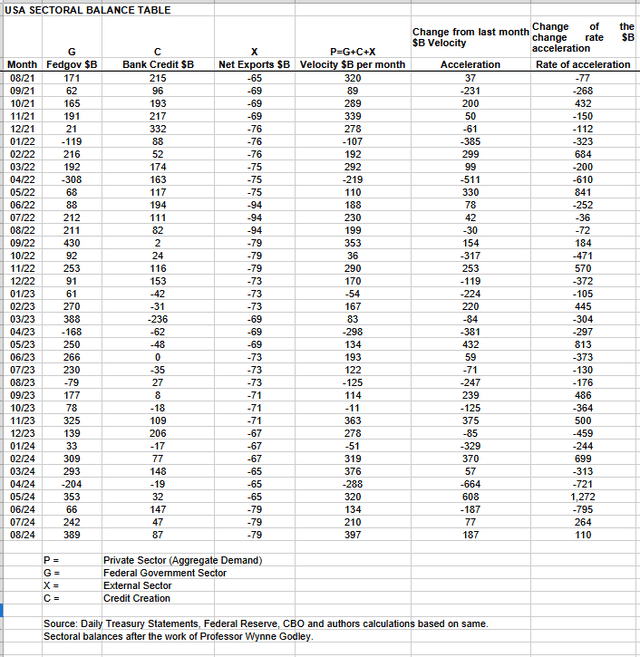
A positive private sector result for August that just ended and supports risk asset markets.
Last month the fiscal flows as predicted pushed the V-shaped recovery to ever greater heights and the month finished much higher than it started, largely thanks to a low starting point. This month the fiscal flows are stronger still and indicate the SPX will stay in positive territory and most likely finish the month higher than it began and also push into October.
The fiscal injection from the federal government was unusually large for this time of year. It could well be the case that the sitting government is holding back on taxation and spending more to look good and win the coming election. This four-year seasonal pattern is a known fact and has over time produced the average stock market pattern shown in the charts below.
Seth Golden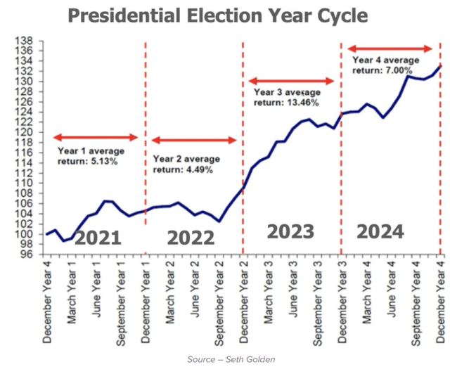
seasonalcharts.com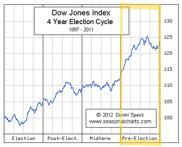
On the above chart, it is clear that on average as we move into the election box and then into the post-election box, the trend is generally upward. Even the pre-election box looks good except for the last part where there is a dip in an otherwise strongly upward-trending line.
In August 2024, the private domestic sector recorded a surplus of $397 billion. This is a positive result for asset markets, as financial balances in the private sector have risen by this much.
From the table, one can see that the $397 billion private domestic sector funds surplus came from a strong $389 billion injection of funds by the federal government (and this includes the new injection channel from the Fed of around $8 billion from interest on reserves that went directly into the banking sector), less the -$79 billion that flowed out of the private domestic sector and into foreign bank accounts at the Fed (the external sector X) in return for imported goods and services. Bank credit creation contributed a strong $87 billion, almost twice as strong as last month.
The chart below shows the sectoral balance data plotted in nominal terms. The calculation is federal government spending or G, plus the external sector (X and usually a negative factor) to leave that amount of money left to the private domestic sector, or P, an accounting identity true by definition.
US Treasury and SPX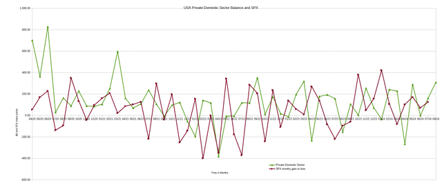
Last month, the chart predicted the stock market would finish higher than it started and would follow the green line upwards, and this indeed did happen. The prognosis for September is the same in that the stock market represented by the (SPX) should follow the green private domestic sector balance upwards and finish higher than it started, and this will most likely push into part of October as well.
The following chart emerges when one graphs the change rate of the information in the US sectoral balances table above and adjusts for impact time lags. This is like a long-range market radar set.
Mr. Robert P. Balan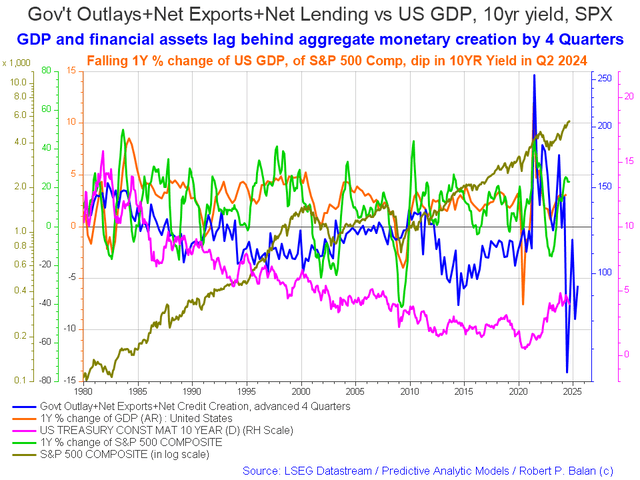
The chart above shows that US fiscal flows (blue line) are spiking up from now and into the end of 2025, which tends to push asset markets up and provides a strong undercurrent upwards, and goes some way to explain why markets have gone so well this year even though the fiscal flows from month to month have only been moderate at best.
The table below shows the total federal government withdrawals from their account at the Federal Reserve Bank. A withdrawal by the federal government is a receipt/credit for the private sector and therefore a positive for asset markets.
US Treasury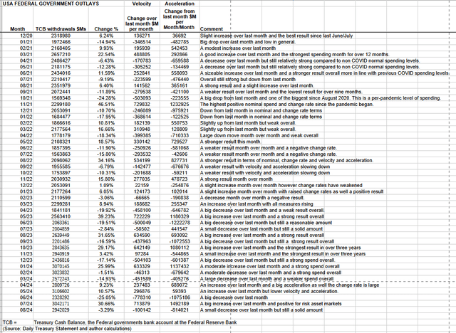
The table shows that total outlays decreased slightly over the previous month and are still moving in the $3 trillion range again. The reason the net deficit spending was so relatively large in the face of weaker overall spending was that less was extracted out of the private sector via taxes, charges, and other sorts of federal fees.
The federal government has a major tax collection event coming up in the middle of September. This month has the benefit of a small treasury interest payment at the end of the month.
These flows produce a local seasonal high in the middle of September, and then markets fall until about the end of October. However, in an election year, this seasonality may not apply given the pork barrelling that is occurring as we go into the last months of the federal election round. Local seasonality could well be trumped by the four-year presidential cycle seasonality, and most likely will be.
The sitting government wants to be re-elected and so will hold back on taxes, fees, and charges and tend to spend more if possible leading up to the day of the election to make voters feel good at the time of voting even if they have had a miserable time up to now.
The next Fed meeting is slated for next week, and I believe the most likely outcome will be that rates will remain unchanged or even a small rate hike might come.
Despite what you might read about the market wanting and expecting a rate decrease, I believe it is not likely to get one until there is a real and present crisis forcing the Fed’s upward bias to be stopped. History shows that they raise or maintain high rates until there is a crisis, and only then will rates be lowered. On top of that, they have not met their 2% inflation target, and nor will that ever happen while rates are over the inflation target because high rates cause inflation in and of itself via a general price rise due to the higher cost of credit a portion of which is found in the production costs of every good and service in the economy.
As economic data continues to surprise to the upside and come in hot, I believe the case for a rate cut will fail, and slowly the narrative will change to a need to cool an overheating economy with more rate hikes.
One might ask what is heating up the economy in the face of higher rates? The answer is that the US working-age population is peaking and causing aggregate demand for all things to rise and will continue to do so well into 2025 as the chart below shows.
What will cool the economy, cure inflation and cause a recession, and lead to low interest rates will be when the US working-age population rolls over and declines after 2025 as shown in the chart below.
Mr. Robert P. Balan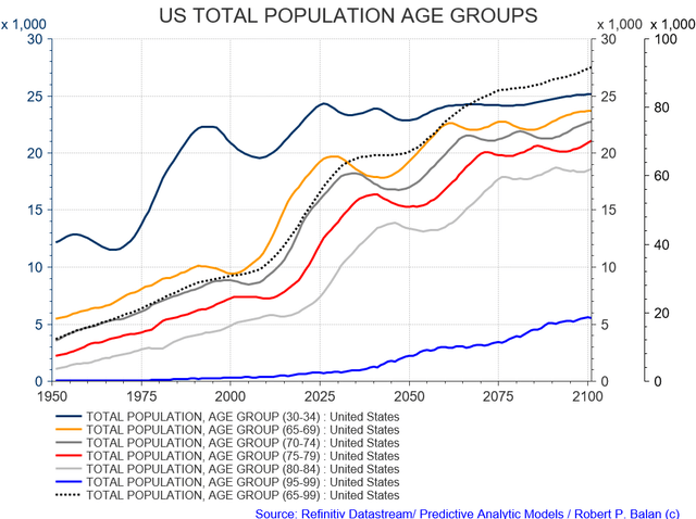
The following chart is one of the best predictive models for what the Fed is going to do at its next meeting.
Mr. Robert P. Balan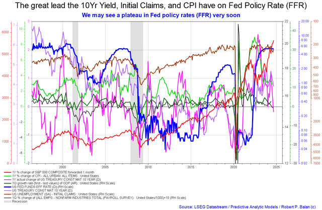
What we have now is the plateau (dark blue line) before the storm that occurred just before each of the last recessionary periods, shown in the chart as a shaded vertical line.
One of the most often misused predictive indicators of a recession is the inversion of the yield curve. Here the misinformed say that after the yield curve has inverted, a recession follows twelve to eighteen months later. The truth of the matter is that after the yield curve has inverted for the second time, a recession follows twelve to eighteen months later.
This is shown in the following chart.
ANG Traders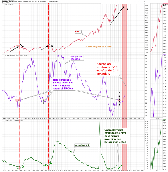
ANG Traders is accurately tracking this indicator and his chart shows that the yield curve has inverted once this cycle and has now un-inverted for the second time. The yield curve now needs to be inverted one more time and the recession really will follow twelve to eighteen months later and is shown as a red vertical shaded area, the coming penalty box.
It is no accident that this time with the peak and decline in the US working-age population, shown in two charts further up in this article.
A wise and benevolent federal government could steer around these events with the right policies; however, we have never had such a thing and that trend is not likely to change, so the boom and bust and misery are baked into our political economy.
Behind all these trends is the first principle fact that aggregate demand is going to sag after it has peaked in 2025 and that will take down risk asset markets and the real economy as it has done in regular generational twenty-year cycles. But between now and then will be boom times.
On the larger world macroeconomic side, we have the G5 chart below. The chart shows the level of money creation by the top five world governments (the G5) in a change rate format, along with a host of other indexes. This chart gives a sense of important inflection points and direction.
Mr. Robert P. Balan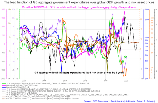
At present, risk asset prices (purple line) are rising with G5 expenditures (black dotted line) and are likely to keep doing so until the end of the calendar year, propelled by both national-level fiscal flows and the presidential election seasonal flow patterns.
Read the full article here


Leave a Reply